My 2020 data visualizations
A sample of data visualizations I made in 2020


This is a place to keep an archive of my data visualization and other projects and track my progress as I learn new stuff around data visualization. Friendly reminder that my top priority when designing and implementing a chart or a plot is accuracy, accessibility and ease of understanding, not aesthetics.
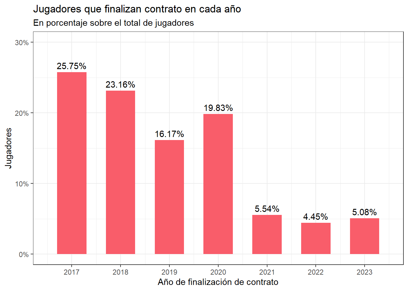
FIFA Contracts #
A graph showing the percentage of active footbal players (in 2017) that end their contract in each year.
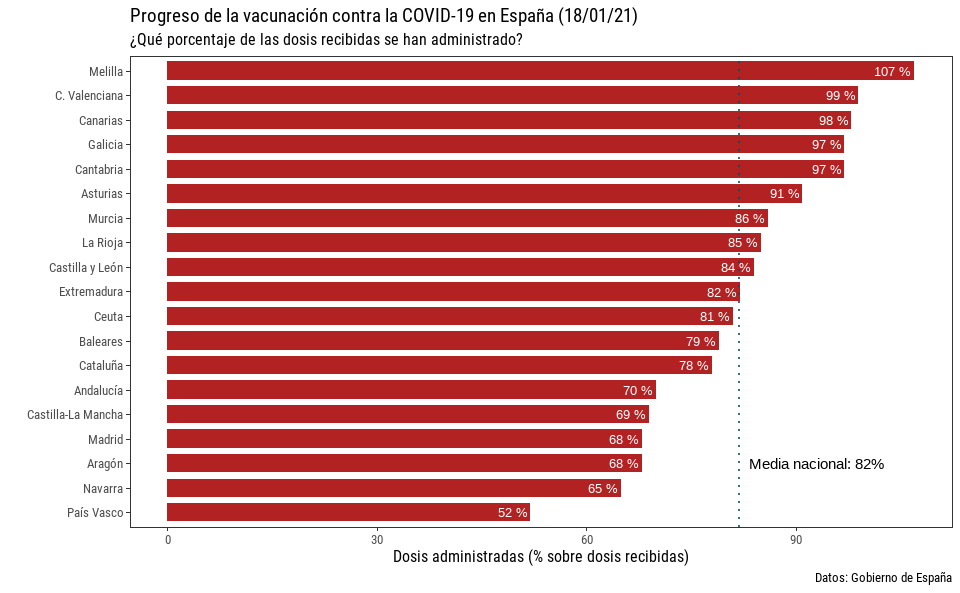
Spanish COVID-19 vaccination progress #