Fixing Visualizations I
Trying to improve some data visualizations around the web.


Data visualization is tricky. It's not an easy task, but it's sometimes one of the most critical stage in the life cycle of a data science project. You may have tons of great, clean, pre-processed data; but if you don't manage to display it in a way that adds value to the public, data becomes pointless.
This is a field that isn't free of opinionated subjective bias and personal preference, but there are certain standards and guidelines that apply to the majority of cases and can make or break a data visualization. Here I will be gathering examples of bad data visualization in a blameless way. That's because the point of this post is not to shame or humilliate anyone, but to help others spot this mistakes and avoid getting misled by bad data visualization. Sometimes it's because of lack of knowledge, tight deadlines or even bad faith in some cases. However, the outcome is almost the same: bad data visualization leads to wrong conclusions.
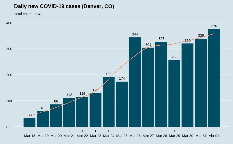
1. Daily New COVID-19 Cases in Denver #
Source: @Carnage4Life
I came across this chart on Twitter a couple of days ago.
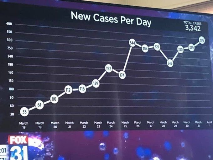
There are a couple of things going on here:
- Y-axis scale is not consistent.
- Data points are so big they span a couple tens of cases.
- A line chart may not be the best choice for this use case.
- Some context is missing: Where? When?
A non-consistent Y-axis is not showing truthful proportion between data points. It starts at a rate of 30 cases between ticks, but then it shrinks to 10, theng goes back up to 30, and finally 50. For example, the leap between March 25 and March 26 appears to be smaller than it really is.
The decision to make data points big enough so that they can fit the data label (text showing the value), comes with an unfortunate side effect: some data points span even 50 different numbers.
Now it's probably time for the most subjective issue: choosing the type of plot. Here's where you probably need more context and domain knowledge about what you're trying to show with your plot. With daily new COVID-19 cases, we're dealing with some sort of time series. Both line graphs and bar charts can be used to plot a time series. However, I think a line chart might be misleading in this case. Daily COVID-19 cases are independent of each other and have no relationship between each data point because they are basically measuring different things. It would make much more sense, for example, if we were plotting total or active number of cases over time. Nonetheless, this is more of a personal preference kind of design decision.
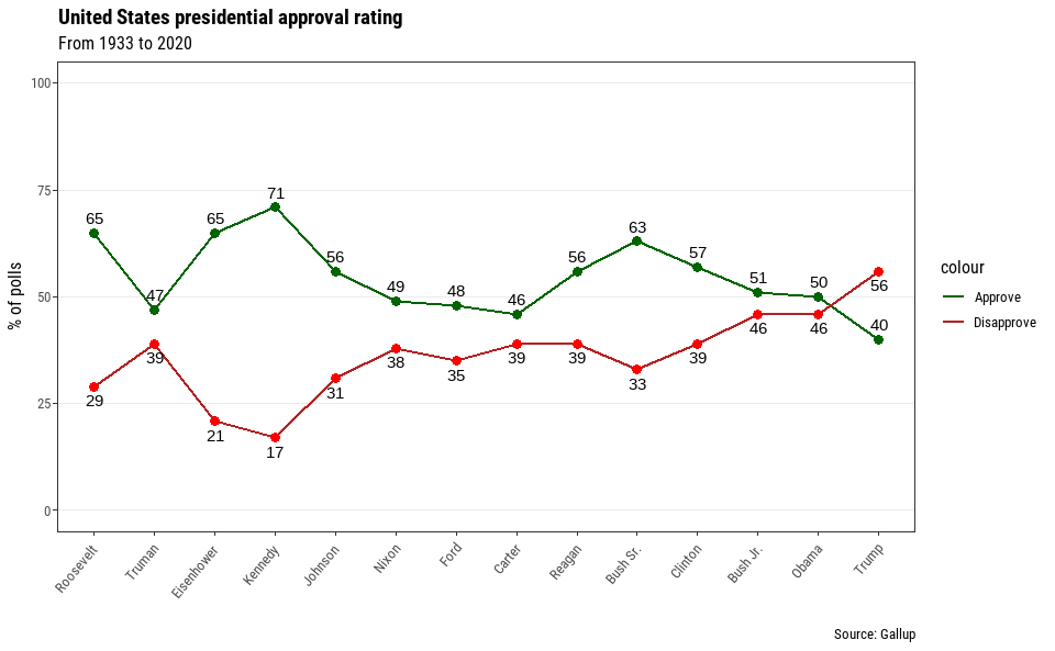
2. Presidential Approval: career averages #
Source: @ThisWeekABC
@ThisWeekABC tweeted this chart a few days before Joe Biden's inauguration.
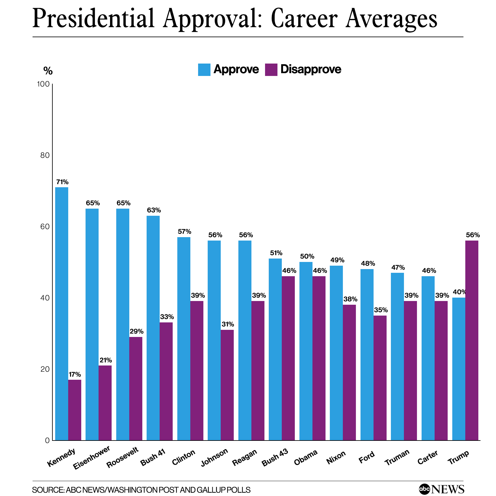
What are some of the things that could easily be improved?
- X-axis is not in chronological order
- Looks a bit clumsy
- Shows a fake trend
First of all, Presidents of the United States are sequential (they even have a sequence number) and should be ordered when compared. It's like a time magnitude because they are synonyms with time periods (usually 4-8 years). It's weird to see George W. Bush placed before his father in a chart. Not only does this look confusing to the observer, but it is misleading. It's ordered by approval rate, thus showing a trend that is not true: approval ratings are decreasing with time. I wouldn't consider it misleading if the chart title was something along the lines of Top Presidents of the United States by approval rate, but it's not.
On the other hand, trying to fit both approval and disapproval rate in the same bar chart ends up a bit clumsy in my opinion. The use of a grouped bar chart in this case is not wrong, but could be improved. For example, two line graphs (approval, disapproval) can show each value's trend over time without sharing the same space. Also, gaps between lines shows the difference between approval and disapproval rates.
What are some key benefits of this chart?
- Chronological order lets us spot trends in the data.
- Two lines looks less clumsy than two bars.
- Space between lines acts as a secondary visual.
3. Spanish Vaccination Rate #
Source: Antena3 Noticias (18/01/2021)
A Spanish national news program showed this sort of chart/table showing the percentage of received COVID-19 vaccine doses that had been administered by region.
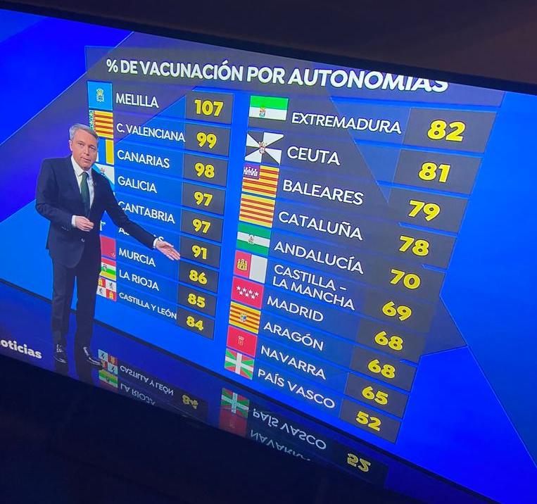
What could be improved here?
- The only encoding is the actual data.
- Flags are cool, but don't convey any information that's not on the region name itself and take space.
- It's not easy to compare regions.
- It's missing context: date, an average, what does 107% mean...
There's not much to discuss here. 17 catagories, just one value per category and on the same scale; sounds like a bar chart. But, in this case, an horizontal bar chart. Why? Because it helps us compare sizes across a higher number of categories (regions).
A couple of add-ons that can help take this visualization to the next level are a vertical line at the mean value splitting the data in those above and those beyond average vaccination rate and an explanation of what a value of 107% means in this domain. Also a way of future-proofing or protecting our plots' usage is by simply showing the date, which also adds more context.
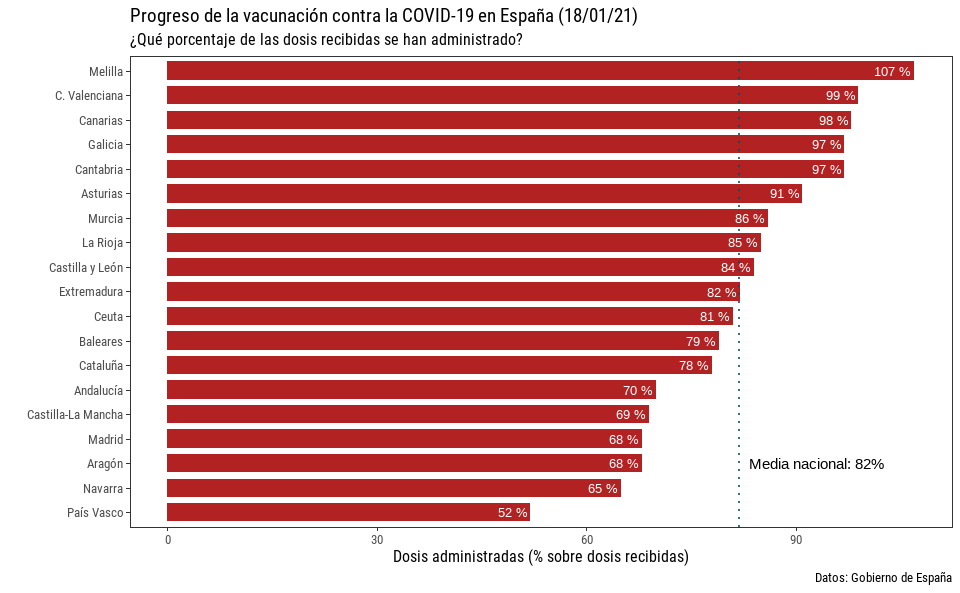
What have we improved with this fix?
- Bars let the observer compare and distinguish all regions at first sight
- It's easy to provide a reference (national avg) to add information
- Now it's not only the quantity, but also the difference between quantities that are visualized
- Adding the percentage symbol to the data label helps in remembering that we are visualizing relative and not absolute values.
- Previous: My 2020 data visualizations