Visualizing reference ranges for medical tests
A visual approach to understand blood test results of a sample at a glance


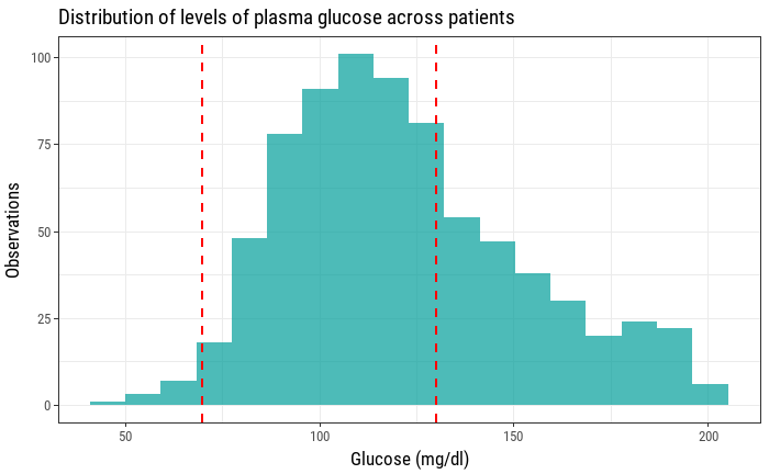
Blood tests are one of the many tools that doctors and health care providers have to assess certain aspects of our health. A simple basic metabolic panel (BMP) can lets us know our levels of sodium, potasium, chloride, bicarbonate, blood urea nitrogen, creatinine and glucose. We can visualize the levels of a certain biochemical indicator in a sample of patients using an histogram.

However, this doesn't show us anything about how healthy our sample of patients is, how many of them have too much of a certain measure, how many of them have too few, etc. For every laboratory analysis there is a thing that's called a reference range, an interval that helps interpret a blood test result. Usually, everything that falls out of that interval is something that needs checking and can be a sign of an underlying condition. In our previous example adding a couple of vertical lines can help us visualize how are sample glucose levels compare to the reference range.
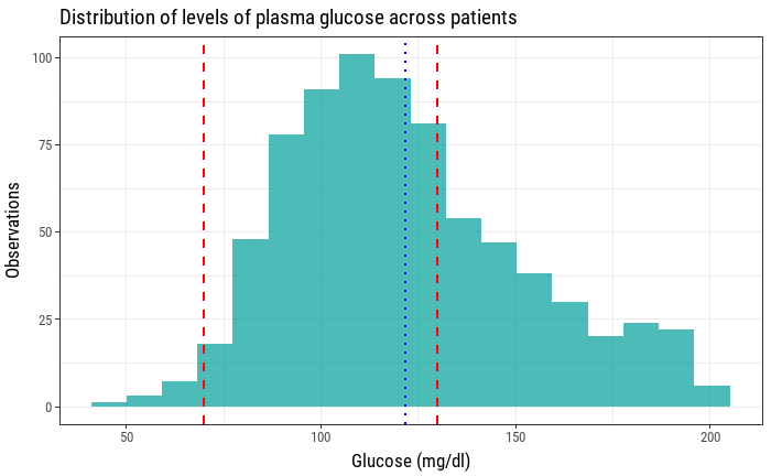
This is better, but it's still missing some information that could be useful. As this is a sample of 763 patients, it would also be interesting to know how the mean is positioned relative to these reference values. The mean of plasma glucose levels can also be visualized as a vertical line with its x intercept as the mean value.
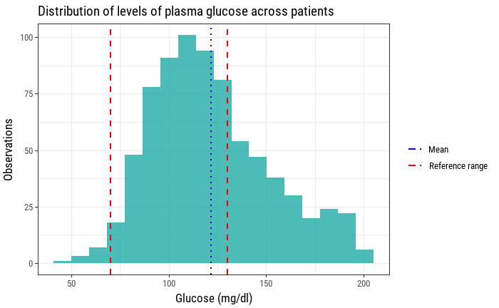
Now this histogram is showing the distribution of plasma glucose values across patients, how many of them fit inside the interval indicated by the laboratory reference values, as well as the mean plasma glucose level of this sample. For the sake of clarity, it's convenient to add a legend now that we have two types of vertical lines that show two different values.
Focusing on aesthetics now, we can get rid of some of the plot's elements that are not adding any value like the grid lines. We can also take advantage of the white space that our histogram has left inside the plot to allocate our legend. Also adjusting the colors to fit daltonism and accessibility guidelines can help widen the spectrum of people that can find our plot useful.
Code
ggplot(diabetes, aes(x=Glucose)) +
geom_histogram(bins=n_bins, fill="#A9A9A9") +
geom_vline(aes(color="Reference range", xintercept=low_glucose, linetype="Reference range"), size=1) +
geom_vline(aes(color="Reference range", xintercept=high_glucose, linetype="Reference range"), size=1) +
geom_vline(aes(color="Mean", xintercept=mean(Glucose), linetype="Mean"), size=1) +
labs(title="Distribution of levels of plasma glucose across patients",
     x="Glucose (mg/dl)",
     y="Observations",
     color="",
     linetype="",
     caption="Data: N. Inst. of Diabetes and Diges. and Kidney Dis.") +
scale_color_manual(name="", values = c("black", "firebrick")) +
scale_linetype_manual(values = c("dashed", "dotted")) +
theme(axis.title.x = element_text(vjust = 0, size = 13),
      axis.title.y = element_text(vjust = 2, size = 13),
      strip.background = element_rect(colour="white", fill="white"),
      panel.grid.major = element_blank(),
      panel.grid.minor = element_blank(),
      legend.position=c(.8, .85),
      )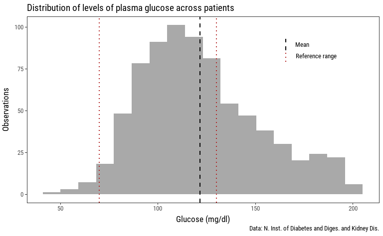
What are some observations we can make just by looking at this new plot?
- Most of the patients' plasma glucose level fall inside the "healthy interval".
- The mean plasma glucose level falls inside the reference range.
- There are are a lot more patients with high plasma glucose level than those with low level of plasma glucose.
Therefore, we are providing the observer with, at least, three new insights about the same data using the same amount of space.
Bonus #
A Basic Metabolic Panel consists of more than the one element we showed (plasma glucose). Here's how a full BMP would look like if we apply the same procedure to the other biochemical indicators.
- Previous: Fixing Visualizations I